Why do consumers buy one product over the other? According to Harvard professor Gerald Zaltman, it has a lot less to do with logic than the mechanisms of the subconscious mind. In Zaltman’s book, How Customers Think: Essential Insights into the Mind of the Market, the professor reveals many exciting ideas that can be helpful to marketers and brands. By studying consumers’ unconscious physical reactions, Zaltman found that what they think or feel often contracts with what they say. Why? Because emotion is what drives purchasing behaviors (and decision-making in general). Let’s take a walk in the customer’s shoes to reflect on the emotional impulses behind one buying decision- and it’s one of mine!
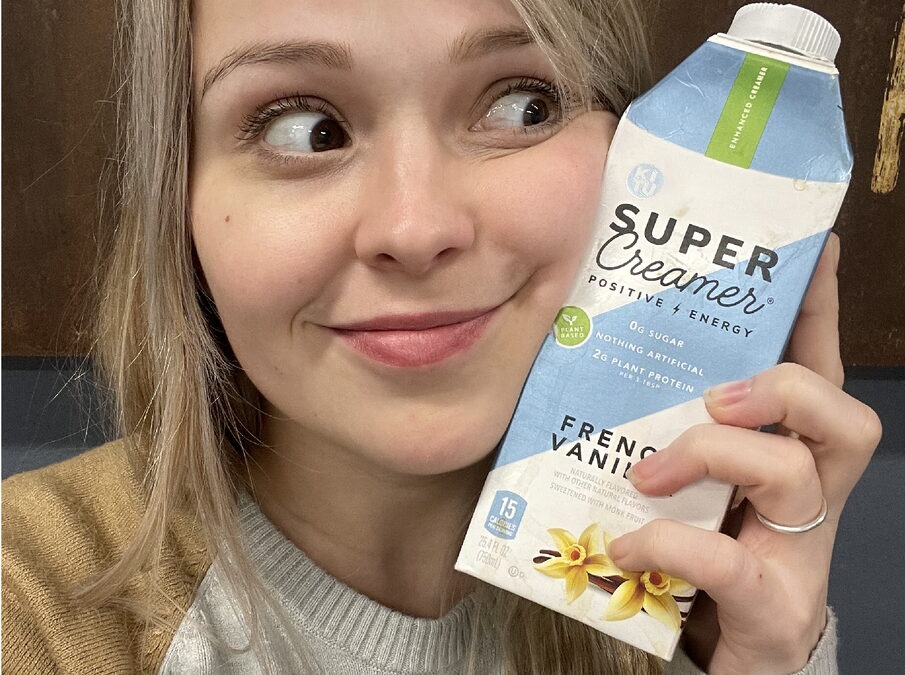
While in the dairy aisle looking for coffee creamer, I saw a unique carton shape that reminded me of a spaceship. If Zaltman asked me why I bought it, would I tell this learned man of Harvard that I am drawn to spacey-looking stuff? Well, he works at Harvard, and saying “I like space” sounds stupid… However, that’s the thing about spending your own money: it doesn’t have to make sense to anyone else! The shape of the package made it stand out on the shelf, and once I picked it up, I noticed how the blue accents had a metallic sheen to the print, which attractively caught the light.
Secondly, I liked the mix of fonts in the product name, with ‘super’ in bold and ‘creamer’ in cursive. Mixed fonts look fantastic, and this captured that balance of power and sweetness that indicated what to expect in their product. In this case, Kitu’s creamer is made of plant protein and sweetened with monk fruit, so it’s a lot healthier than most other coffee creamers. I am passionate about writing and language in general, and as a buyer, it may sound crazy, but the font matters to me! Having studied marketing, I’m intrigued when a brand catches my attention, and I like to reward their artistic choices with my buying power. Also, it makes me feel good to eat healthily, so when I noticed it contained a healthier sweetener, I was curious! It made me feel proud to buy it.
Lastly, I was impressed with the cap! It cleverly has an arrow printed right on it, so you know which direction it needs to turn to open. It makes so much sense that I was shocked I had not seen it before! Kitu manufactures this carton out of 100% recycled material, and I like to put my dollars where my mouth is when it comes to buying green. Altogether, I purchased this product because I like space, the design was attractive, cleverly made, healthier than other options, and the package was recyclable. You could also say it made me feel like an earth-conscious coffee-loving astronaut with a penchant for design. It’s all emotion!
Contact us today for a free consultation about your current packaging and where we see the market going in your category to help you come up with something new, fresh and out of this world.
